From Friction to Flow
A product design sprint exploring how AI could help users navigate confusing public-service tasks with more clarity, confidence, and guidance.
- Role
- Product Design Lead
- Team
- 4 designers
- Timeline
- Spring 2025
The Project
Redesigning a disconnected government chatbot into a persistent, accessible AI assistant that helps Ontarians navigate complex service flows with more confidence.
Impact Summary
Designers led
Guided a mixed-experience team through research, ideation, prototyping, and final storytelling.
Survey responses synthesized
Turned survey and audit findings into personas, HMW statements, and a focused product direction.
Top services had chatbot support
High-volume flows lacked in-page guidance when users needed it most.
My Role
As Product Design Lead, I guided a 4-person mixed-experience team through research, synthesis, ideation, prototyping, and usability testing while keeping the product direction cohesive.
I owned:
- Defining the product direction
- Translating research into design principles
- Creating and refining user flows
- Guiding interface decisions across the prototype
- Preparing the final case study narrative and presentation
Why this mattered
Public-service tasks carry administrative burden: users must find information, understand eligibility, gather documents, and complete forms correctly.
Everyday tasks should feel straightforward, yet users are often left to decode long instructions on their own.
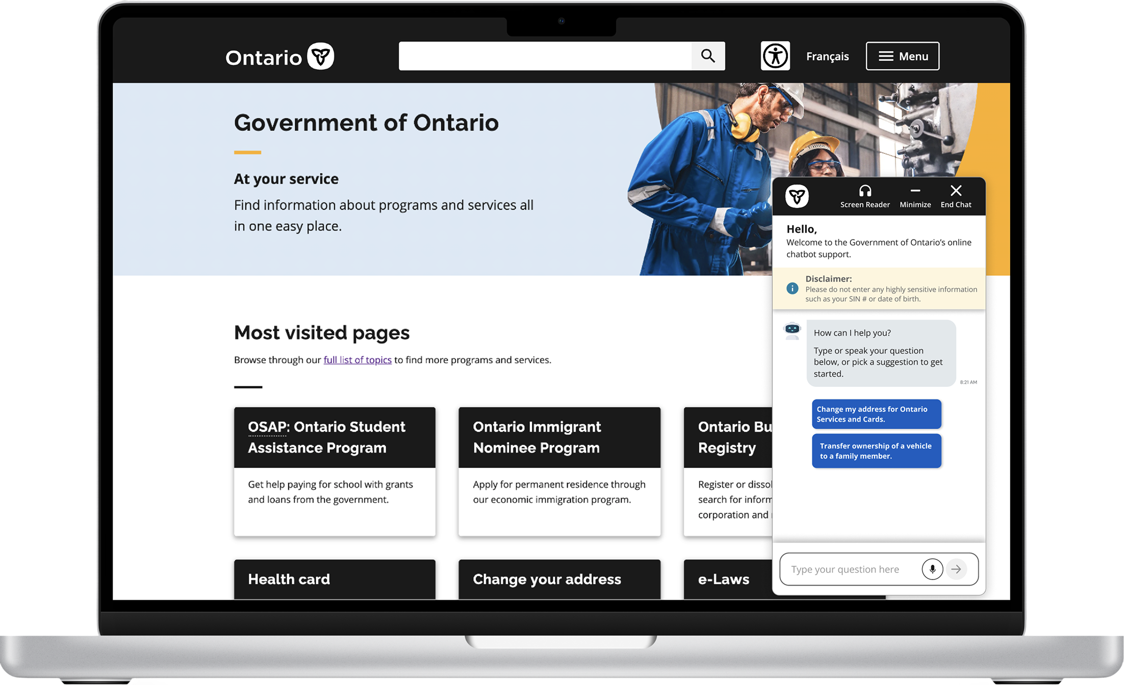
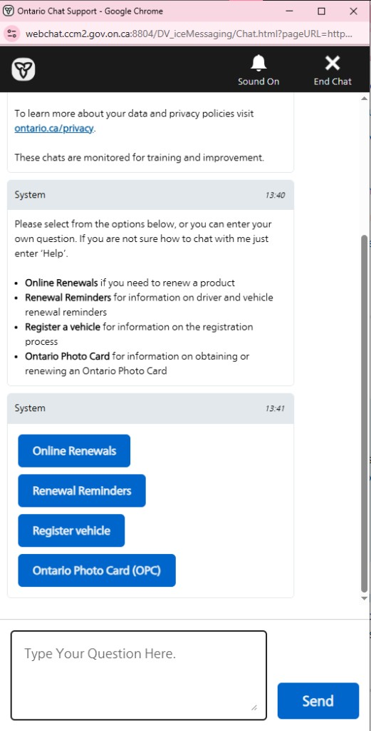
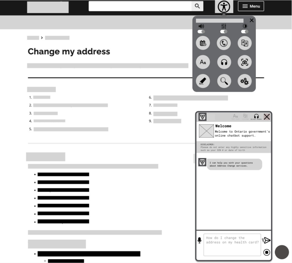
The existing chatbot felt disconnected from the task
The chatbot looked like support, but behaved like another task to manage.
- Opened in a separate browser window
- Relied on fixed, hard-coded responses
- Failed to understand natural language
- Offered limited guidance during complex service flows
- Created extra context switching instead of reducing it
- 1 Separate window - pulls users out of the ServiceOntario flow they came to finish.
- 2 Policy wall first - long privacy and monitoring copy before any guidance appears.
- 3 Redundant options - the same services listed as bullets, then again as buttons.
- 4 Fixed menu paths - rigid button choices, not a conversation that understands intent.
- 5 Free-text mismatch - invites typing, but the flow is driven by preset menus.
What users needed was not more information, but clearer guidance.
Users needed clearer guidance, not more information.
Concise information
Users felt overwhelmed by dense instructions and wordy pages.
Clear next steps
Users were unsure what documents, forms, or actions were required.
Accessible support
Older and less tech-confident users needed clearer, more flexible guidance.
A human lens
Alex, 20
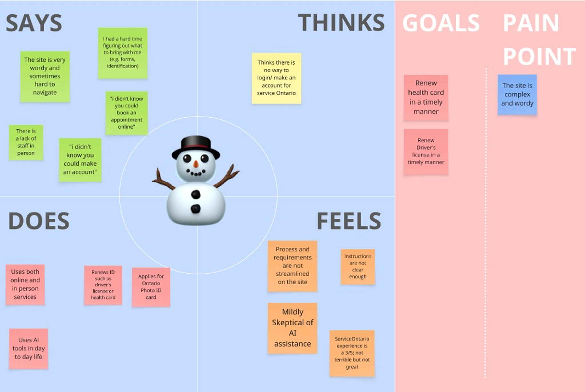
Wants to update documents quickly but finds the site wordy and confusing.
Gary, 70
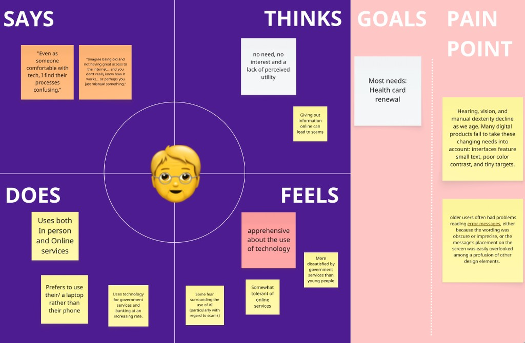
Wants to complete services independently but faces small text, unclear steps, and low confidence.
“Even as someone comfortable with tech, I find their processes confusing.”
How might we make ServiceOntario’s digital journey feel as guided as an in-person visit?
This became our north star. Instead of redesigning the entire website, we focused on one high-potential feature: the chatbot. It reframed the chatbot from “answering questions” to “guiding progress.”
Ideation & prioritization
Crazy 8s for breadth, impact/effort for focus.
We prioritized by impact and effort to focus on what could reduce friction within the sprint.
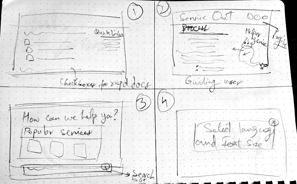
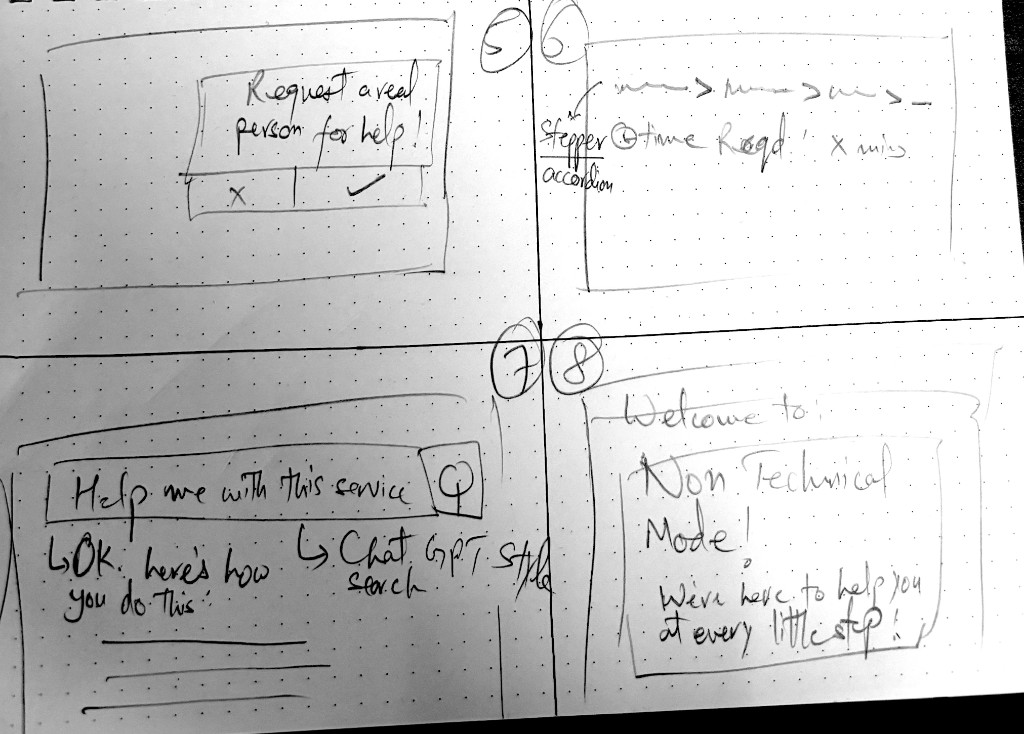
- Step-by-step chatbot guidance
- Persistent in-page support
- Visual page highlights
- Simplified language
- Accessibility-first controls
- “Give me the link” vs “Show me the steps” options
Final solution
Designing AI support without making it feel invasive
Moderate comfort with AI meant optional support, not a site replacement. We avoided sensitive data, kept official handoffs visible, and put user control first.
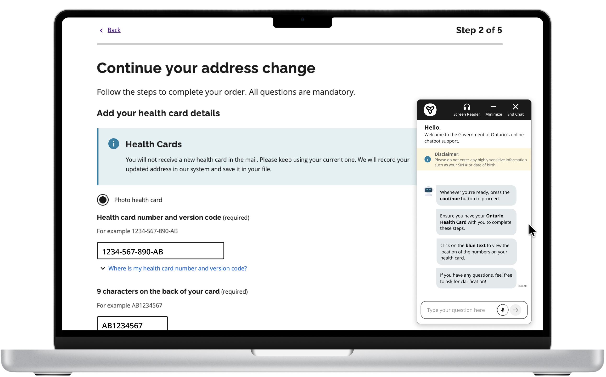
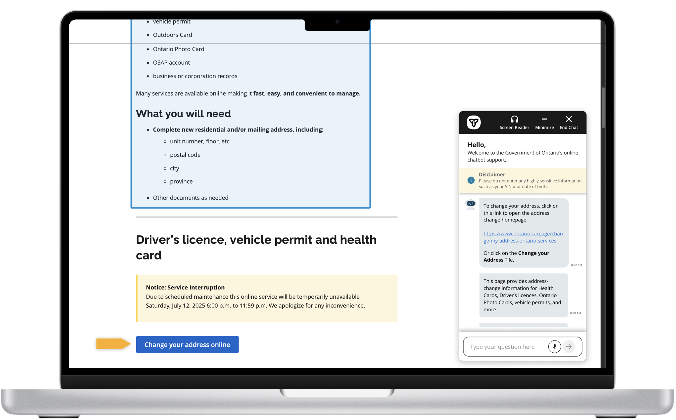
Persistent in-page chat
The chatbot stays with users while they navigate instead of opening in a separate browser window.
Why it mattered: users no longer have to manage a separate window while completing official forms.
Step-by-step guidance
Users can choose to be walked through the process instead of reading long instructions alone.
Why it mattered: people who wanted guidance could follow a path without reading every instruction on the page first.
Visual page highlights
The assistant points users to relevant page sections, reducing confusion about where to look.
Why it mattered: users spent less time scanning long pages to find the one detail they needed next.
Accessibility-first interaction
Voice input, screen-reader support, clearer text, and adjustable accessibility controls make the assistant more inclusive.
Why it mattered: support could adapt to different comfort levels without forcing everyone into one interaction mode.
Testing insights
Help must be flexible: quick links for some, full walkthroughs for others.
Methods: moderated usability test · high-fidelity Figma prototype
Participants tested the address-change flow and chose between “Give me the link” and “Show me the steps.”
What worked
- Users liked visual highlights.
- “Give me the link” was easier to follow for users who wanted a quick answer.
- Users felt the chatbot reduced confusion from verbose instructions.
- Users found the concept useful, especially for less tech-confident users.
What we improved
- Clarified “minimize” vs “end chat” after some users found minimize confusing.
- Refined “Show me the steps” after early flows felt harder to follow than the quick-link path.
- Improved chatbot placement and persistence.
- Made the interface more readable.
- Supported both quick-link users and guided-flow users.
Users did not all want the same level of help. The chatbot needed to be flexible, not forceful.
Leading through ambiguity
Created structure when the team had no playbook: criteria, phases, and a focused scope.
I narrowed a broad AI/accessibility theme into a focused chatbot redesign while coordinating across uneven availability.
- Set criteria to choose the problem space
- Balanced sync coworking with async progress
- Closed backlog gaps and kept scope on one high-impact feature
What I learned
Good public-service design reduces cognitive load when people feel stuck.
This sprint showed that reducing cognitive load matters more than adding technology.
Scope is a design skill
Chatbot focus let us go deep on interaction and accessibility.
Clarity beats volume
Users needed next steps and in-page guidance, not more text.
Help should be flexible
Quick support and full walkthroughs must coexist.
Accessibility early
Persistent support and readable flows work best as core requirements.
Leadership through structure
Clear goals and criteria helped a mixed-experience team deliver.
AI needs restraint
Optional guidance beats automated decision-making.
What’s next
MyAccount integration
Let users sign in, save progress, and receive more personalized support.
Expanded accessibility menu
Add adjustable text size, screen-reader settings, voice input, and assistive controls.
More usability testing
Validate the hi-fi prototype with more users and measure task success, time on task, satisfaction, and accessibility compliance.


